We're not big on rules, but we've created a set of guidelines to help you bring our brand to life.
On this site, you'll find high-level guidelines and the assets our partners use most. Check out our Big Green Guide if you'd like to take a deeper dive into our brand.

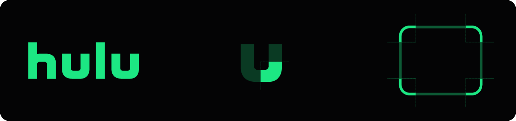
Whenever possible, the Hulu logo should be green. In cases where we want to make an impact by using a green background, the logo can be black. Color combinations are shown in order of priority.
The logo's safe zone is equivalent to the height of the "u" on all sides.

Hulu green is our primary brand color. It represents the fresh distinctiveness of our brand and stands out from more traditional entertainment palettes. Black is our secondary color and is used over green. Dynamic Gradient is used to create depth and bring a cinematic quality to designs.
PMS: 7479
RGB: 28 231 131
CMYK: 76 0 70 0
HEX: #1ce783
RGB: 4 4 5
CMYK: 75 68 66 88
HEX: #040405
RGB: 4 4 5 > 24 57 73
HEX: #040405 > #183949
Our green is important to us. If you ask people "What comes to mind when you think of Hulu?", the word "green" is one of the most common responses. So, understandably, we’re quite particular about it.
DOWNLOAD PRINT GUIDELINES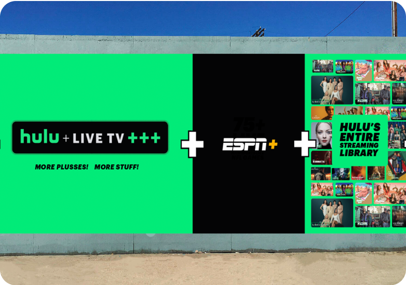
Typography is our visual voice, bringing range, nuance, and attitude to what we have to say. Hulu uses the Graphik type family in all applications.
Purchase Graphik Vendors should coordinate with Commercial Type on purchase of the appropriate license for their project (e.g. Web, App, Desktop, etc.)Icons are part our emotive and navigational language. They also bring attitude and texture to our stories. The icon and the rounded Vessel should always have a contrasting color.
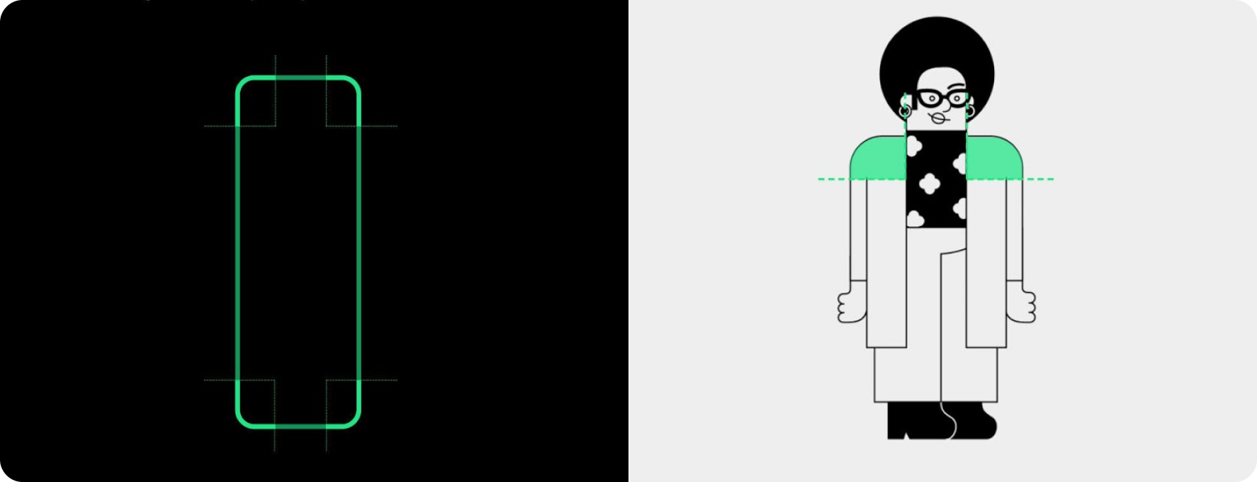
Our illustration style builds off the shape of the Vessel. Adding a little spice (and cute characters) to our communications.
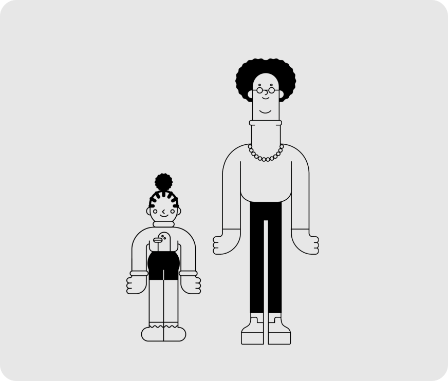
Character Spots

Hero Illustrations
The Vessel is a visual metaphor for TV, redefining what TV is. A system born from our logo, it is more than just a frame. As we fill it with meaning, it becomes the connective tissue across all brand touchpoints.
Divide longest edge of the Vessel by 100.
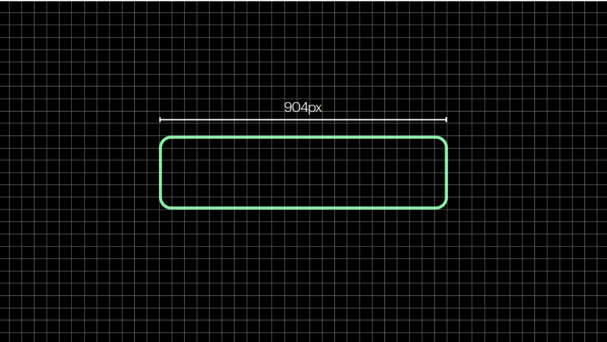
Vessel width: 904px
Stroke weight: 9px
Divide shortest edge of the Vessel by 6.
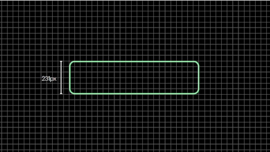
Vessel height: 231px
Corner radius: 38px
If using multiple Vessels in a single piece of creative, all corner radius and stroke weights should align to the average (not smallest, not largest).
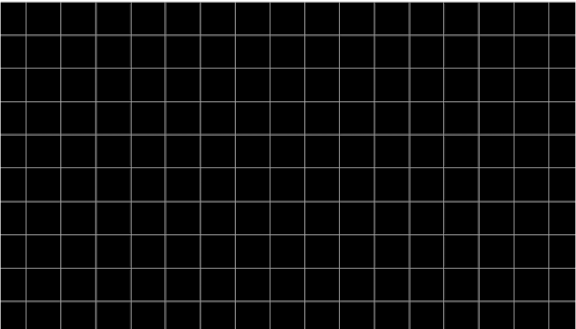
Don’t underestimate the power of the grid.
A simple, flexible system that brings Hulu together on every platform.
Using the following approach,
we can create a consistent 1:1 grid system that works across all formats.
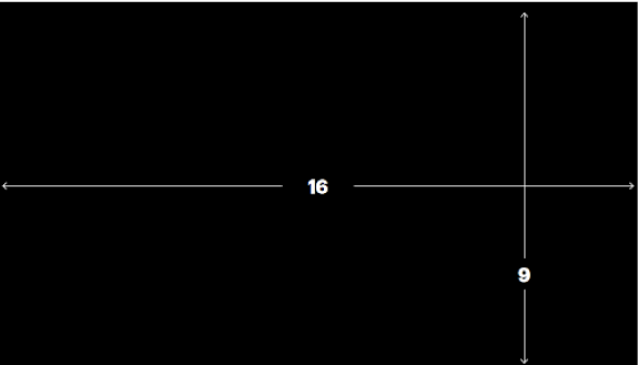
Define the aspect ratio of the format.
Use the aspect ratio to create a 1:1 grid. 16 units across by 9 down.
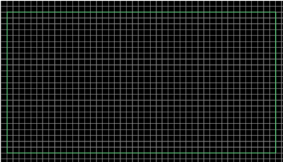
Then multiply the grid units equally to ensure the grid is dense enough.
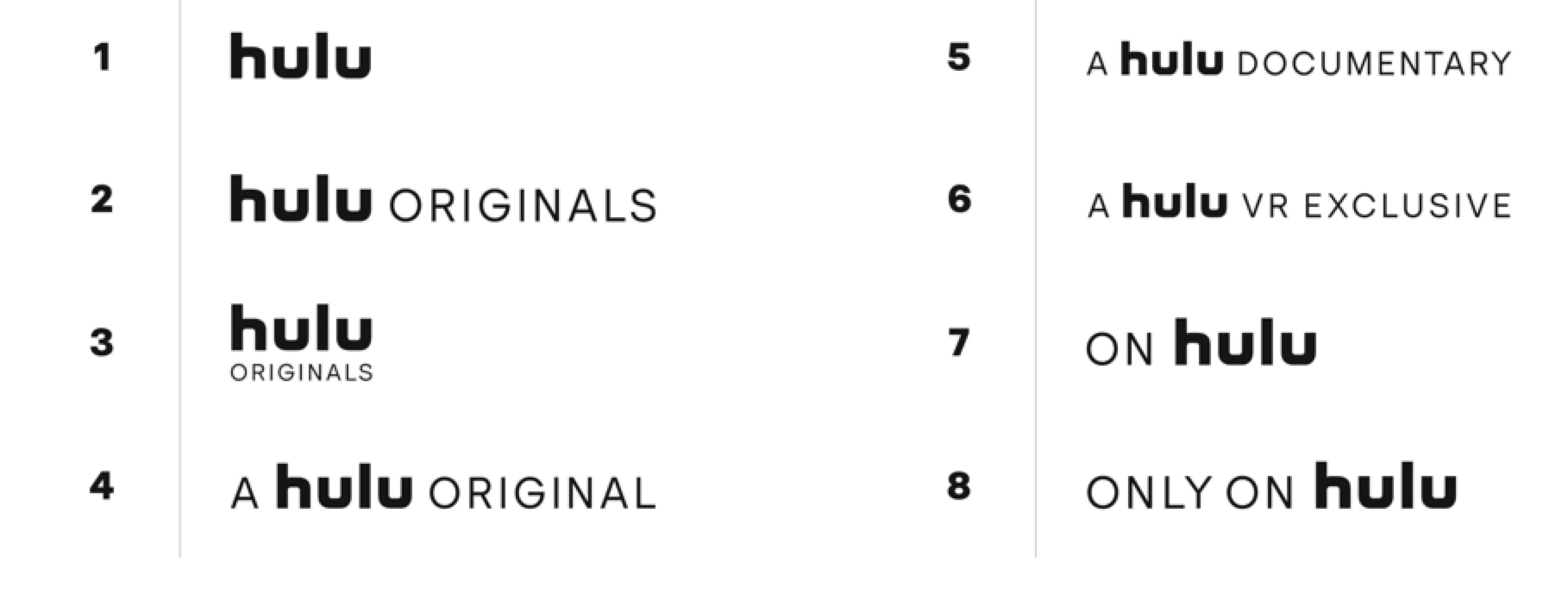
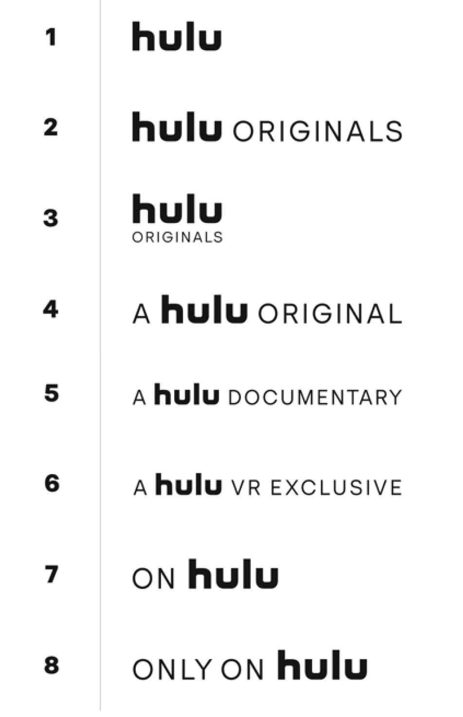
To unify how availability information appears across our creative, Hulu has created a lockup system which is applied to all single-title Hulu Original creative.
The single-title CTA should always appear in the lower portion of the creative as shown below. Always ensure that the green Hulu logo is legible over the background.
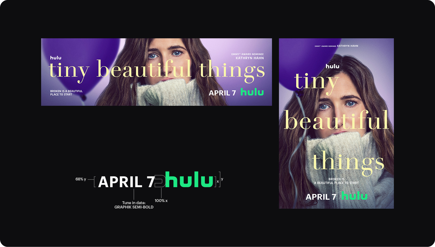
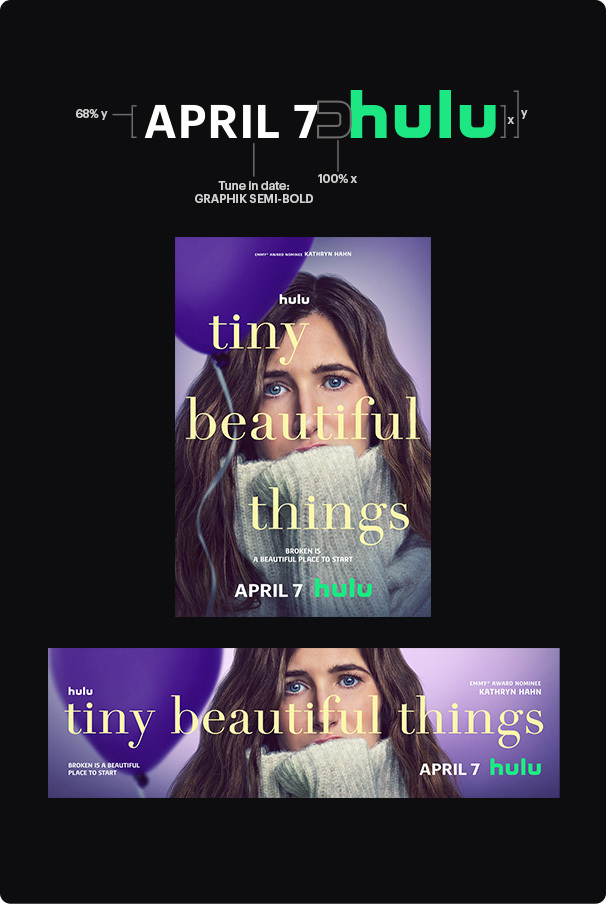
There are 2 options for single-title AV CTAs. For longer promos, use the 2-card system with the availability date on its own card.
For shorter promos, use the combined single card system.


The static toolkit exists to ensure visual consistency and maximize brand linkage. Below are the main layout formats used for acquisition-based static creative.

Text Only
Single Show
Full Bleed
Single Show
Non Full Bleed
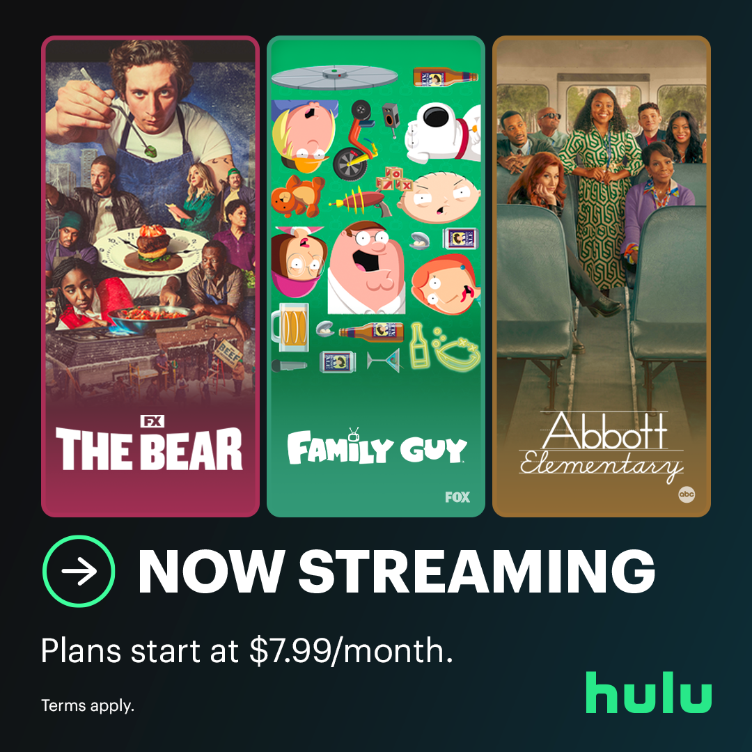
Multi Show
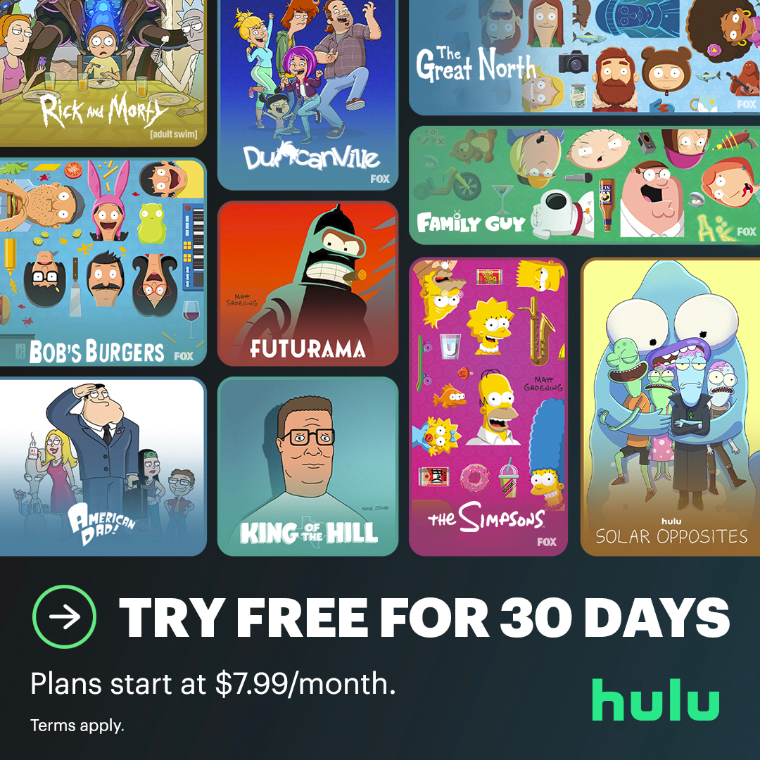
Library
Using key visual elements of the design toolkit, the motion system has been developed to elevate content and flex across multiple genres and campaigns, on any device, at any time.
The ident system transports you into the Huluverse. Through the Vessel and our rich sonic identity, we enter the world of entertainment.
Plays before all Hulu content.
Plays before all Hulu Originals.
Approved Lockups